
CAT.
Direcció artística, conceptualització, disseny gràfic i packaging de F5, el nou (no) disc de Doctor Prats.
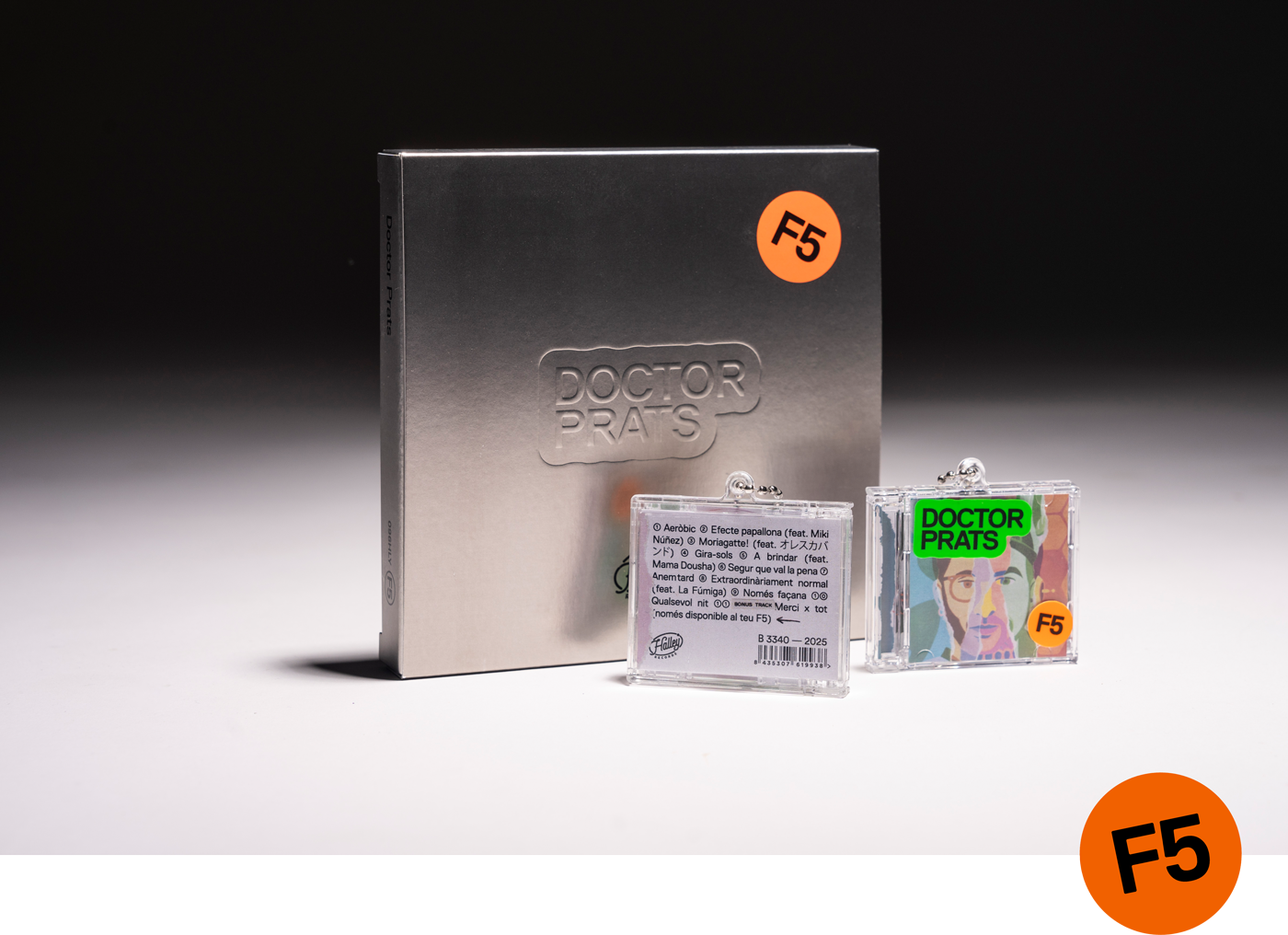
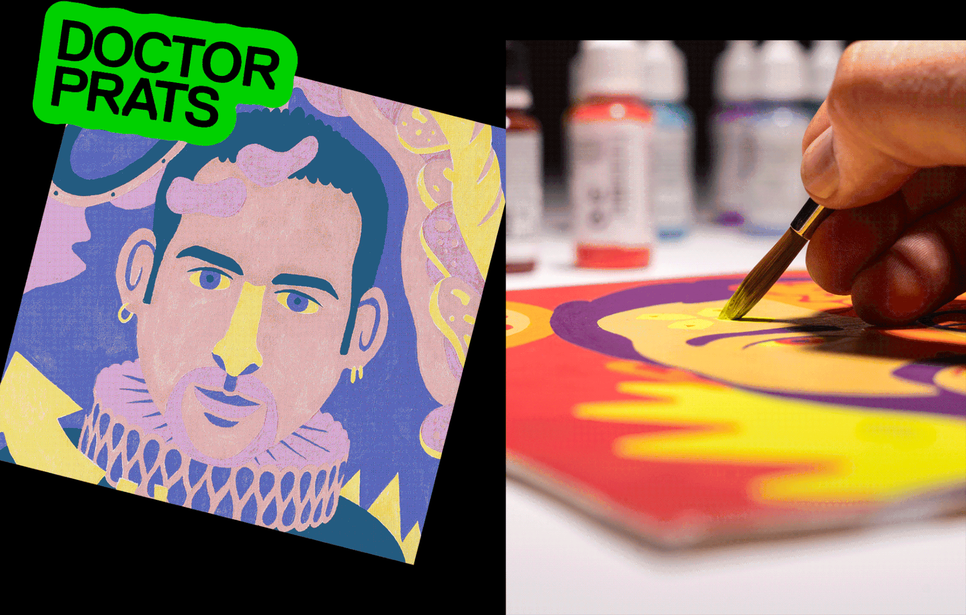
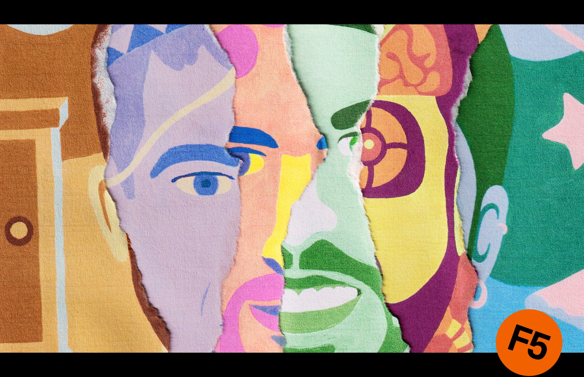
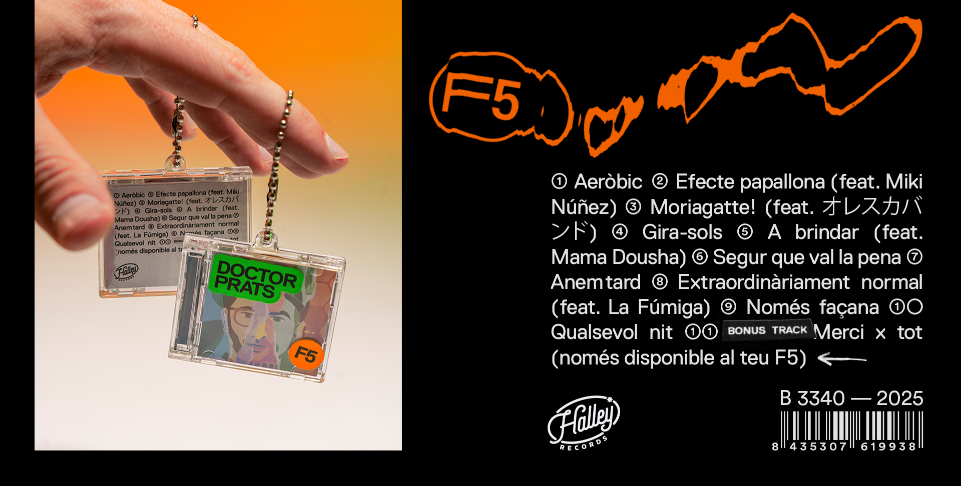
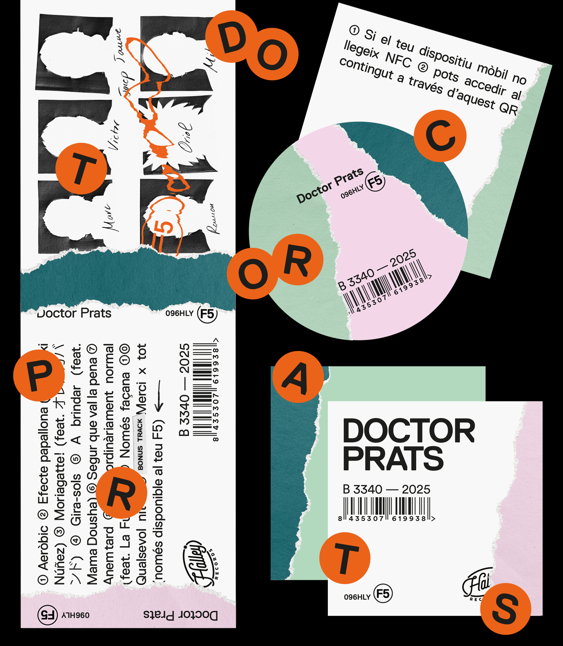
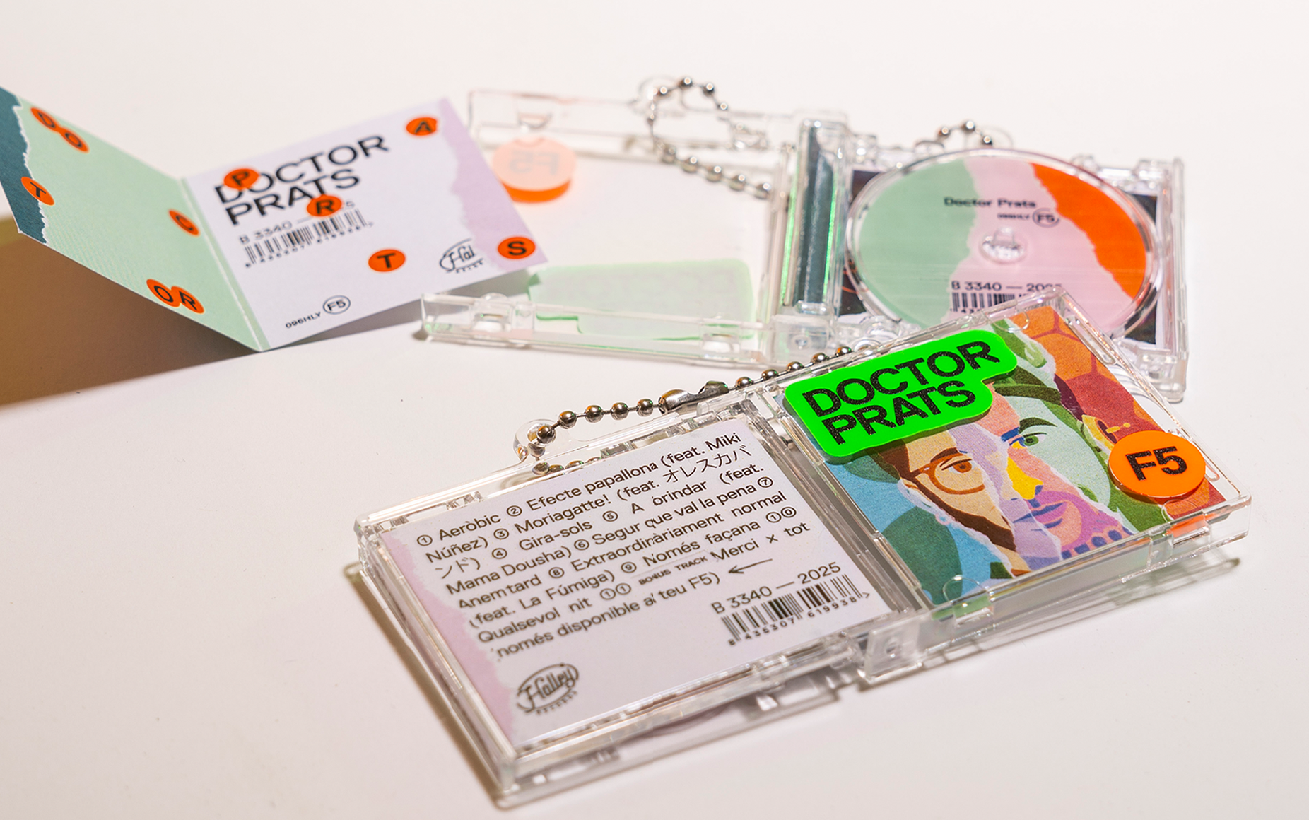
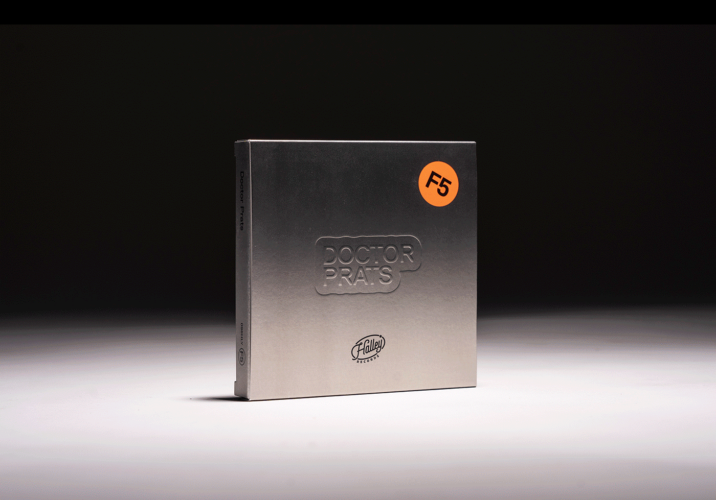
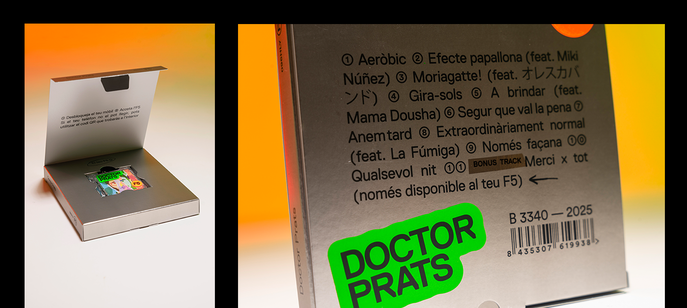
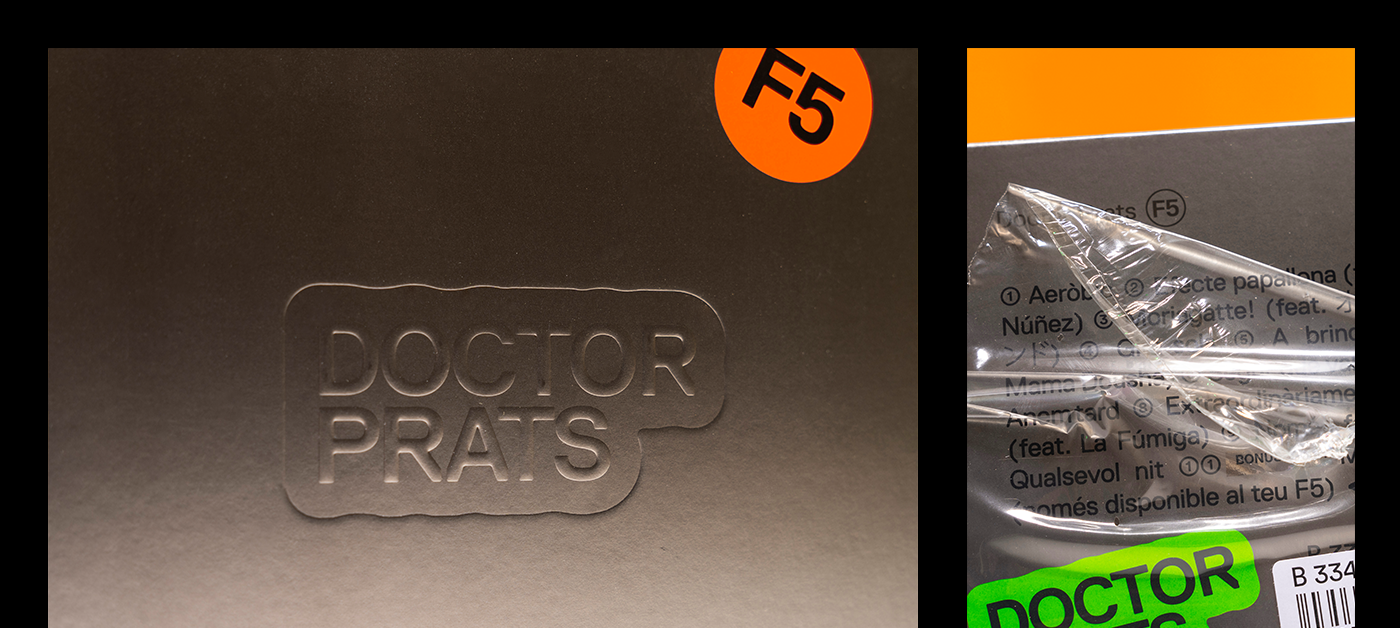
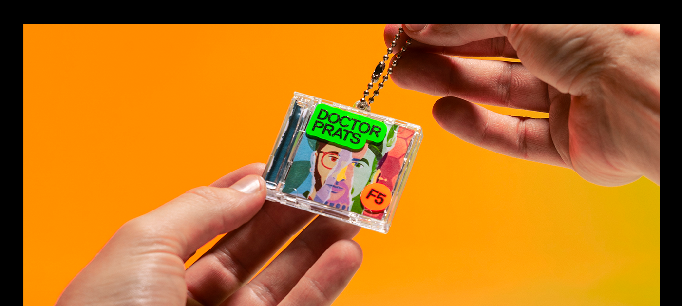
El cinquè disc del grup, titulat F5 (la tecla que s’utilitza per recarregar o actualitzar) simbolitza tant la seva cinquena etapa com un tornar a començar, una actualització i un retorn als orígens. A partir de retrats de cada membre, hem creat un únic rostre compost, que representa la unitat i reinici del projecte. Més enllà del disseny gràfic, també vam pensar un format diferent i innovador per materialitzar aquest nou àlbum. Vam trobar la solució en un suport que incorpora tecnologia NFC, fet que permet anar molt més enllà de la simple escolta de les cançons. Les seves dimensions reduïdes el converteixen en un objecte fàcil de portar sempre a sobre i gairebé en una peça de culte.
El cinquè disc del grup, titulat F5 (la tecla que s’utilitza per recarregar o actualitzar) simbolitza tant la seva cinquena etapa com un tornar a començar, una actualització i un retorn als orígens. A partir de retrats de cada membre, hem creat un únic rostre compost, que representa la unitat i reinici del projecte. Més enllà del disseny gràfic, també vam pensar un format diferent i innovador per materialitzar aquest nou àlbum. Vam trobar la solució en un suport que incorpora tecnologia NFC, fet que permet anar molt més enllà de la simple escolta de les cançons. Les seves dimensions reduïdes el converteixen en un objecte fàcil de portar sempre a sobre i gairebé en una peça de culte.
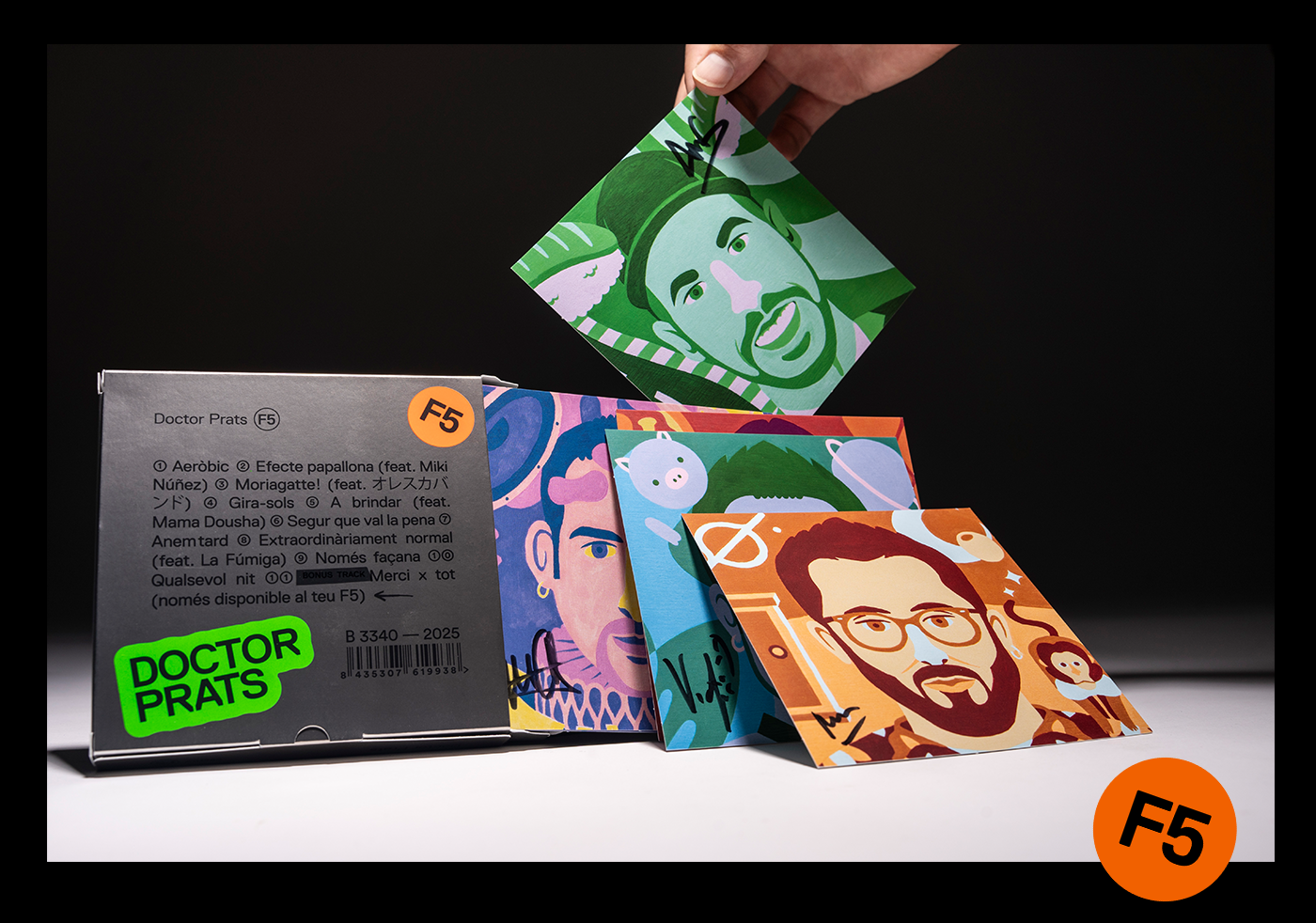
Finalment, vam decidir tractar tot l’àlbum com si d'una joia es tractés. Això ens va permetre, per una banda, que aquest nou format transgressor es pogués distribuir a les botigues de discos i, per l’altra, reforçar-ne el caràcter de peça única incorporant postals impreses, dedicades i signades per cadascun dels membres del grup.
El resultat, una experiència d’accés a l’àlbum que esdevé única i personalitzada: permet crear un avatar exclusiu per a cada usuari i gaudir de contingut variat i interactiu, com jocs, informació de la gira, videoclips i, òbviament, l’escolta del disc.
El resultat, una experiència d’accés a l’àlbum que esdevé única i personalitzada: permet crear un avatar exclusiu per a cada usuari i gaudir de contingut variat i interactiu, com jocs, informació de la gira, videoclips i, òbviament, l’escolta del disc.
ENG.
Art direction, conceptualisation, graphic design and packaging for F5, the new (non )album by Doctor Prats.
The group’s fifth album, titled F5 (the key used to refresh or update), symbolises both their fifth stage and a fresh start, an update and a return to their origins. Starting from individual portraits of each member, we created a single composite face that represents the unity and reboot of the project.
Beyond the graphic design, we also devised a different and innovative format to materialise this new album. We found the solution in a support that incorporates NFC technology, allowing the experience to go far beyond simply listening to the songs. Its small size makes it easy to carry around at all times and almost turns it into a collector’s item.
Finally, we decided to treat the entire album as if it were a piece of jewellery. This allowed, on the one hand, for this transgressive new format to be distributed in record stores and, on the other, to reinforce its unique character by including printed postcards, each dedicated and signed by one of the band members.
The result is an album-access experience that becomes unique and personalised: it allows each user to create an exclusive avatar and enjoy varied and interactive content such as games, tour information, music videos and, of course, listening to the album itself.


Direcció d'art, disseny gràfic i packaging / Art direction, graphic design and packaging: @parteedesign
Impressió / Printing: @cideyeg_packaging
Client: @doctorprats
Client: @doctorprats